The highly respected LA-based art director discusses the stories behind her work, including Céline Sciamma’s Portrait of a Lady on Fire and Michael Haneke’s Funny Games
A beautiful movie poster, like the film itself, can reward on repeat viewings. For Portrait of a Lady on Fire, LA-based artist Akiko Stehrenberger created an optical illusion: the poster, at first, illuminates the simmering romance of Céline Sciamma’s lesbian love story (and our third-favourite film of 2019) with the passionate brushstrokes of a reddening flame. But look closer – in the negative space, two female faces share a secret kiss. The film, if you’re unaware, depicts a forbidden romance in the shadows, how hidden messages can be snuck into a frame, the two-way collaboration of a painting, and the magical art of seeing. Stehrenberger, though, conveys all those themes with a single, perhaps yonic image.
As the winner of 15 CLIO Awards, Stehrenberger is the Bong Joon-Ho of the poster world. Stehrenberger – also a must-follow on Instagram – has conceived, designed, and illustrated posters for films by Michael Haneke, Lynne Ramsay, the Coen brothers, Spike Jonze, Sofia Coppola, Ken Loach, David Lynch, Harmony Korine, Steven Soderbergh, Jonathan Glazer, Alma Har’el, Hirokazu Kore-eda, Jim Jarmusch, Tom Ford, Joachim Trier, Gus Van Sant, Dee Rees and Luca Guadagnino among others. (The two left on her wish list are Wes and Paul Thomas Anderson, if either have Google Alerts.) You have definitely seen her work, even if the name is unfamiliar. When promoting Bad Milo on Conan O’Brien’s chat show, Gillian Jacobs took time to exclaim, “The poster is so near and dear to my heart!”
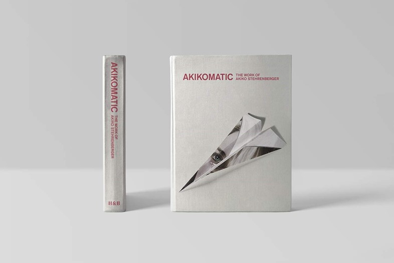
In fact, 15 years worth of Stehrenberger’s posters have been collected in a new book, Akikomatic: The Work of Akiko Stehrenberger – it’s perfect for your coffee table, especially if you live in a cinema lobby. Stehrenberger’s hands-on process is also a rarity in the industry. “The misconception is that I’m just an illustrator,” she tells Dazed. “In traditional advertising, an illustrator is told what to paint, and how to paint it, because an art director has come up with the idea. But I started in this industry as an art director, and, as a cherry on top, I started drawing and illustration. Art director is still very much my title, because I am coming up with the concepts, the illustration style, and the type layout.”
As Stehrenberger is an art director first and an illustrator second, her posters differentiate wildly in style and concept from film to film. So we asked her to talk us through a few of our favourite posters of hers. Here are the highlights of our phone conversation – combined with some email follow-ups (the Photoshop of journalism).
FUNNY GAMES (MICHAEL HANEKE, 2007)
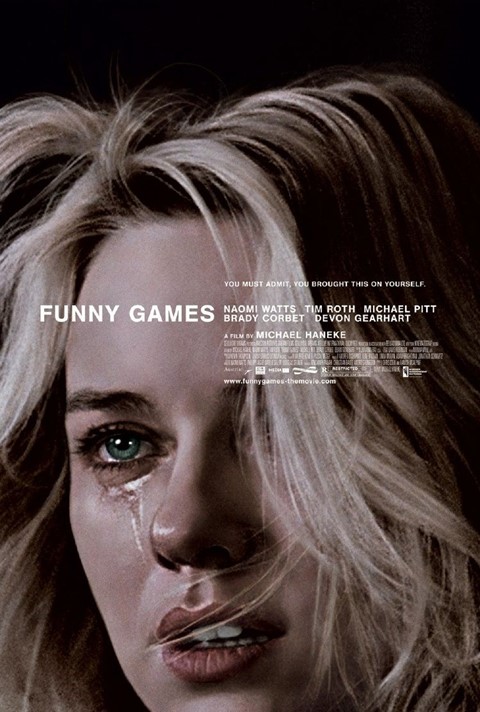
Have you seen Netflix’s new poster for Horse Girl? It’s a cropped close-up of Alison Brie’s emotionally dead face as she’s about to cry.
Akiko Stehrenberger: (she looks it up) Oh, OK, I see it now. Yep. (laughs) It’s funny, because Midsommar recently had a teardrop (on Florence Pugh‘s face). But it happens, you know? I don’t own that crop or someone crying.
Why did you choose the Funny Games poster for the front cover of your book?
Akiko Stehrenberger: I decided to take the Funny Games poster and make a paper airplane out of it – almost like a school kid messing around in class – for a few reasons. I felt this airplane gave some light-heartedness to an intense poster. This paper airplane also bridged the gap from my movie poster work and more silly personal work. I wanted an image that also showcased my conceptual skills as much as my illustration and design skills.
Lastly, to be a bit corny, you can say it’s a metaphor for Funny Games taking me to a completely different place in my career. That poster was responsible for launching my career. In our industry, designers don’t get credit. But a journalist, Adrian Curry, had to find out who created it. He found me, and wrote so many articles about it. He labelled it the best movie poster of that decade.
From there, people started to slowly pay attention to what I was making, and clients were more open to less conventional types of movie posters. Because Funny Games was done in such a weird way, it opened the door for me to do more independent films, too. That poster is so important to me. I get asked about it the most out of any poster. And clients will consistently ask me to rip it off! To avoid being a one-trick pony, I‘ll try to come up with more creative ways of communicating that same feeling, but not having a girl crying.
HONEY BOY (ALMA HAR’EL, 2019)
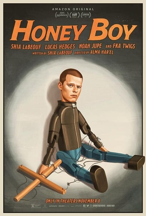
You‘ve done a lot of posters for comedies, including sitcoms like Fleabag and Veep. Is it important to have a sense of humour?
Akiko Stehrenberger: Yeah! I would like to think that my sense of humour is evident in my work, because our job is, basically, in a nutshell, coming up with visual puns.
PORTRAIT OF A LADY ON FIRE (CÉLINE SCIAMMA, 2019)
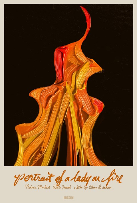
Is your Portrait of a Lady on Fire poster a digital painting? I was zooming in and trying to work out how you did it.
Akiko Stehrenberger: Whenever I’m given enough time, the chance, and the content to do things by hand, I try to do that as much as possible. For this one, I realised that what I was painting in real life wasn’t as dimensional once I brought it into the computer as I wanted. I had to cheat a bit and use a little bit of stock photography of oil paint dabs. So it’s a mix of my own painting and a little bit of help to achieve that really dimensional, glossy look of an oil painting.
How many ideas do you typically present?
Akiko Stehrenberger: I usually present at least five to eight rough ideas at the start of a project. For this title, I came up with maybe six different ideas, and the one that became the poster was the first one in my presentation. I usually put my favourite towards the beginning. And I was really happy that they were drawn to it. I always feel so proud when a client wants to do something so simple.
Of course, being used to how clients are, I presented other ideas that were more complex – you know, a full-bodied portrait of Héloïse, just to give them options. But I was definitely hoping they would go for the optical illusion.
Did they ever ask for Adèle Haenel crying, Funny Games-style, like at the end of the film?
Akiko Stehrenberger: Thank God, no!
A BIGGER SPLASH (LUCA GUADAGNINO, 2016)
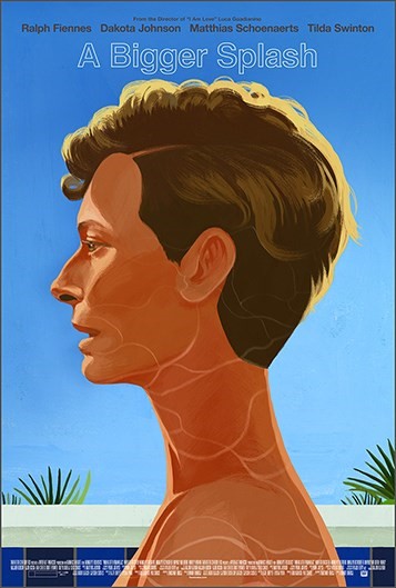
Whenever directors introduce films at festivals, they nearly always say, “I don’t want to say too much. I’d rather let the film speak for itself.” How do posters fit into that conundrum?
Akiko Stehrenberger: I love posters that conceptually and visually do the same, getting someone interested in the film without having to tell the whole story. I strive for that in all my work. I like to leave clues, or as we movie poster designers call it “Easter eggs”, which reward the viewer after seeing the film with finding something new in the poster.
Did you work with Luca for A Bigger Splash?
Akiko Stehrenberger: I didn’t speak to the director directly, and this didn’t become the official poster, but it was presented to the studio. I was brought later on the project, so they had a lot of photographic solves for the film. One of the themes that kept coming up was David Hockney. So I really wanted to tap into David Hockney’s paintings when I came up with this portrait of Tilda.
WE NEED TO TALK ABOUT KEVIN (LYNNE RAMSAY, 2011)
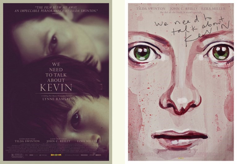
Does it help when someone like Tilda Swinton has such a naturally interesting face? Your posters for A Bigger Splash and We Need to Talk About Kevin have such different approaches.
Akiko Stehrenberger: I love painting people with interesting faces. Although I presented an illustrated option, they went for the photographic one. It was something I composed on Photoshop using unit photography, and it felt like a sweet mother/son moment – but her expression hints that something’s off. I felt that tweaking the colour so it felt a little odd might communicate that it’s not going to be a feelgood movie (laughs). It’s rare that something is accidental. Everything is pretty considered so that I can communicate the proper genre.
HER (SPIKE JONZE, 2013)
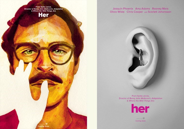
There’s a video of Spike Jonze getting annoyed with a journalist who’s more interested in the sci-fi aspect of Her than the human elements. Was that your take, too? You could have easily had Joaquin Phoenix cradling an iPhone.
Akiko Stehrenberger: Although the story is set in the near future, I felt what I created needed to feel timeless. Even though the Joaquin painting didn’t make it to the end, I felt it communicated the story without feeling too sci-fi. It felt more metaphoric and open to interpretation, so that someone who hasn’t seen the film yet is intrigued by it, and is hoping the questions asked in the poster are answered in the film.
Is it wishful thinking when you propose something like the ear poster? Because surely the studio would want Joaquin’s face front and centre?
Akiko Stehrenberger: That one, I knew it wouldn’t have a chance in hell (laughs). Whether or not my posters ever see the light of day – I still like to show my creativity. I knew, more than anything, this poster – even though I’m getting compensated for it – was a chance for me to make something for me! Warner Bros films usually end up with a big photographic head, but it’s always worth a shot to present something different.
LIFE DURING WARTIME (TODD SOLONDZ, 2009)
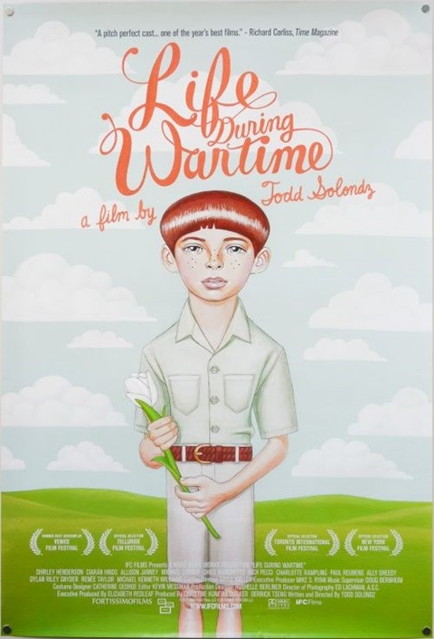
Have you ever had a director you really love personally get in contact?
Akiko Stehrenberger: Yes! One of the first times was when I was freelancing for an agency on Life During Wartime. I’m in an industry where nobody ever gets credit except for the name of the agency. But Todd Solondz went out of his way to call the agency to talk to me, to thank me. I’m pretty sure my soul left my body during that call!
One of the more recent directors I got to work with, which was amazing because we had the same aesthetic and point of view, was Joe Talbot for The Last Black Man in San Francisco.
THE LAST BLACK MAN IN SAN FRANCISCO (JOE TALBOT, 2019)
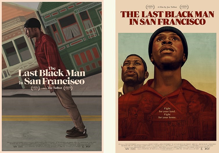
The poster for The Last Black Man in San Francisco really captures the mood of the film in a way that’s hard to put into words.
Akiko Stehrenberger: We ended up doing two posters: one for the client, one for us. The one with the two men with the montage in their chest was more what the studio felt was important, showing the cast and house. We fought to do the secondary poster, which is Jimmie leaning forward on a steep hill. Out of all my experiences, it was the most where I worked and collaborated with a director while also working directly with the studio. It was an interesting tug of war. Joe fought for the same things I did, which is a great plus!
IT FOLLOWS (DAVID ROBERT MITCHELL, 2014)
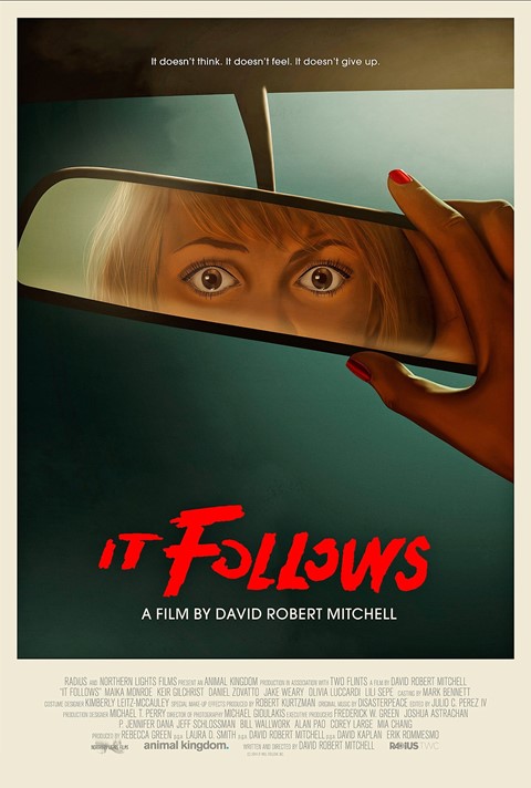
Is it getting easier to push more interesting posters through? Portrait attracted so much attention recently – how is that not a plus for everyone involved?
Akiko Stehrenberger: I think clients are open to less conventional things, because they’re also producing more posters for online and social media. I’ve been really lucky that clients come to me when they need something unconventional. Clients are realising that posters are being collected again. There was a gap, because in the late ‘90s and early 2000s, it was all big photos of people, and more recently it’s swung closer towards art, because they realise there’s a following for this. Sometimes posters get more attention than the film. I think they’re wising up to it, and that’s allowing more creative work to come through.
COLOSSAL (NACHO VIGALONDO, 2016)

You told Creative Review that Portrait was your second optical illusion after Colossal. I’m so sorry – I don’t see it.
Akiko Stehrenberger: That’s fine. But I’m forcing you to keep looking at my posters! So I think I did a good job, either way, right?
Are stupid people like me a problem?
Akiko Stehrenberger: No! It’s the same thing with Portrait. It becomes a Rorschach test. Many people saw different things. I’m honoured that people are staring that long at my posters. Did you see Colossal? Where her bangs curve up, it makes the point of the ear of the monster, it’s as if the monster is beige against a black sky.
Ohhhhhh. I finally get it!
Akiko Stehrenberger: I had the lips match up, to link to the monster being her alter ego. I’m hoping that if people don’t see the monster, they still like how simple the poster is.
AFTER THE STORM (HIROKAZU KORE-EDA, 2016)
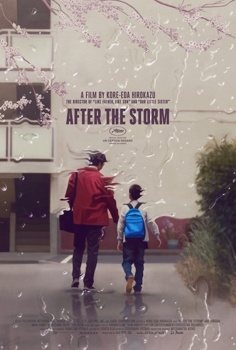
Is Photoshop the software you normally use?
Akiko Stehrenberger: I use Photoshop. With the crazy deadlines, I’ve been doing more and more illustrations digitally but I try to scan in as many textures. If I paint something on a board, I scan it in. I may doctor and edit it in Photoshop, but I still like my pieces to have this certain quality where it doesn’t feel too sterile nor cold.
SPRING BREAKERS (HARMONY KORINE, 2012)
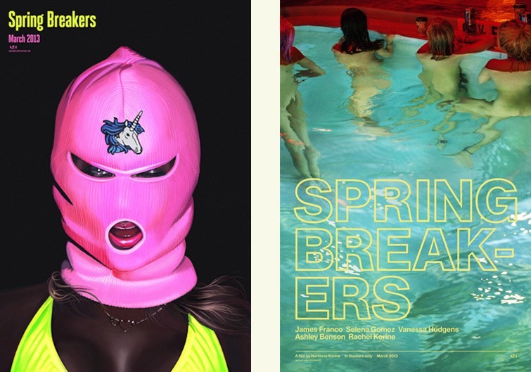
Is it considered a no-no, to confuse people with hyphens in the title?
Akiko Stehrenberger: Yes and no. (The image on the right) was more of me having my way with it than following marketing rules. I thought with a Harmony Korine film, there were looser restrictions. It’s not a surprise it didn’t make it to the end. (The image on the left) was commissioned for a poster, but the marketing team wanted the one-sheet to feel more mainstream. However, they liked the digital illustration and used it for the soundtrack.
A SERIOUS MAN (JOEL AND ETHAN COEN, 2009)
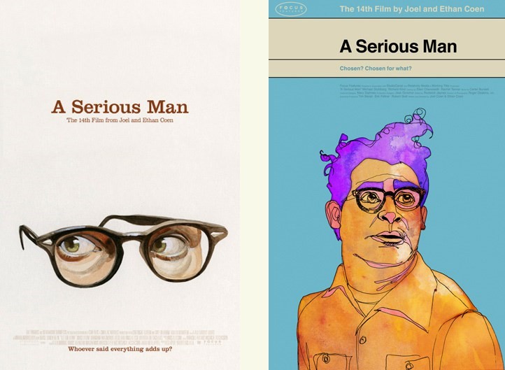
The Coen brothers are famously control freaks who don’t let their actors deviate from the script. How does it feel coming up with an image people will see before the actual film?
Akiko Stehrenberger: A Serious Man was such a surreal, trippy movie. There weren’t huge actors in it at the time. I felt like it opened the door to just make anything for it so I had a lot of fun. Again, these didn’t make it to the end. They used a photo of the main character on the roof of the house. When an agency is presenting these movies to a movie studio, we’re showing them all sides of the spectrum, from very traditional to very creative. Every once in a while, a very creative one sneaks through to the end. It just encourages us to keep throwing them in.
UNDER THE SKIN (JONATHAN GLAZER, 2013)
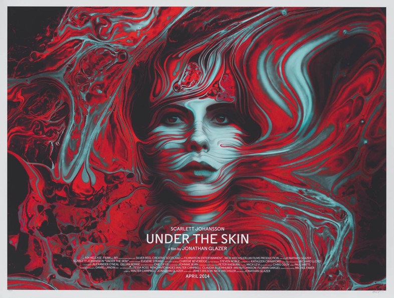
Can you tell me about the balance of having your own creative voice, but also representing the films?
Akiko Stehrenberger: It’s a fine line. I want to do my job as a designer and represent the film accurately, but also want to take the heart of the film and run away with it. If something is not based on reality, I want to open the doors wide and see how far I can take it.
When I try to really consider the genre, as opposed to putting my work in the forefront, is with me constantly changing up the illustration style. I try to make the illustration make sense with the film. Illustration shouldn’t just be done for the sake of doing it. It should serve a purpose. That’s why if you put A Serious Man next to Funny Games, you wouldn’t get that it’s all one person.
INGRID GOES WEST (MATT SPICER, 2017)
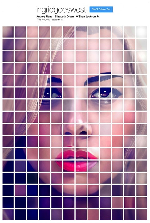
Has joining Instagram in the last year or so affected your process in any way? I don’t know if the constant feedback is a positive or negative force?
Akiko Stehrenberger: It definitely has. At first I thought Instagram would open me up to more criticism. I'm still so self-conscious with every single one of my posts, but it's been nothing but 99% positivity. I guess I’m my harshest critic, or maybe my clients, ha! Instagram is also great to finally get credit for work I've done – since my industry doesn’t give credit to anyone – and showcase my brain on pieces that were left on the cutting room floor.
It's definitely changed my outlook on what I do for a living. I can groan all day about my clients and how insanely short my deadlines are, or how I wanted to do something so much cooler than what was printed. But at the end of the day, I feel honoured to be an independent illustrator and designer with no shortage of work in sight – I desperately need a vacation – with a following that makes me realise that everyone loves and will always love movies. I mean, come on, I get to draw and watch movies for a living. Ain't nobody feeling sorry for me!
Akikomatic: The Art of Akiko Stehrenberger is available to buy now. Her website is akikomatic.com and her Instagram is @doyrivative


