Kevin Timon Hill – who also worked on Isle of Dogs – tours through The French Dispatch exhibition in London to reveal the elaborate process of bringing Anderson’s ideas to life
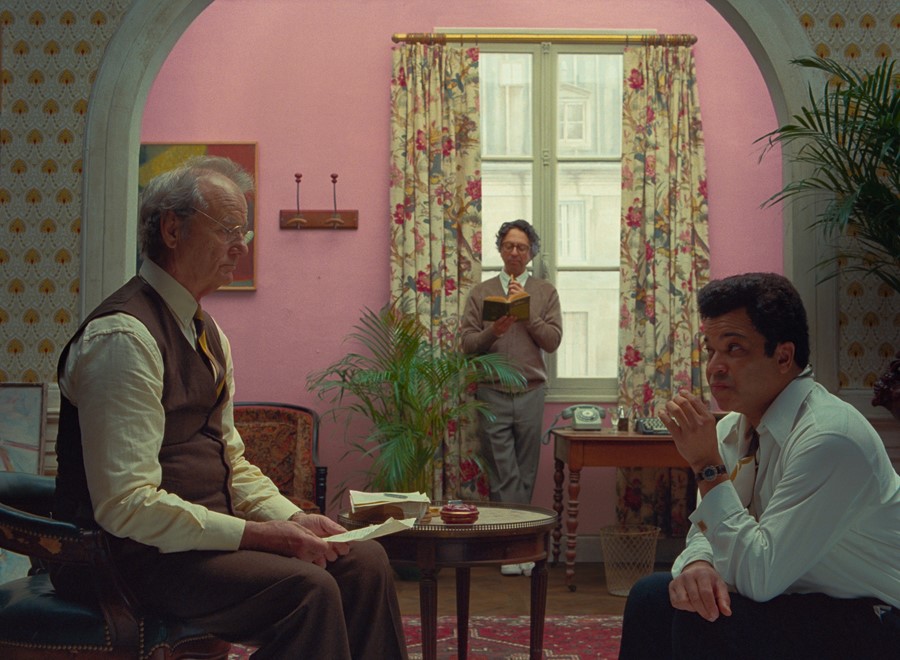
Delayed for what felt like a lifetime due to COVID, The French Dispatch is one of this year’s most anticipated films. Starring a typically illustrious ensemble cast including the likes of Benicio del Toro, Adrien Brody, Tilda Swinton, Frances McDormand, Timothée Chalamet, Bill Murray, and Owen Wilson, Wes Anderson’s latest film is centred around an American magazine based in the fictitious French town of Ennuie-sur-Blazé.
The staff gather to write the obituary of the publication’s recently deceased editor, Arthur Howitzer Jr (played by Murray), and memories of this intriguing character develop into four elaborate narratives that explore the life of a criminally insane artistic genius, whose pioneering artwork busts open the concept of painting, by way of a violent student revolt, drugs, a bicycling travelogue, romance, and fine dining. Art, as with all of Anderson’s films, is our guiding light.
The film finally opens today (October 22) in cinemas across the UK, so we took a walk through The French Dispatch exhibition at 180 The Strand with the film’s art director, Kevin Timon Hill. We explore Howitzer’s office, complete with a detailed notice board chronicling the magazine’s current issue-in-progress, his desk and personal effects, as well as the prison cell which confines artist Moses Rosenthaler (played by del Toro), the show invites visitors to enter the curious world of Ennuie-sur-Blazé.
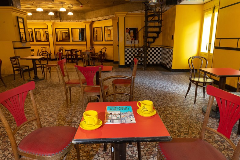
The exhibition features real props, artwork, miniatures, and costumes, culminating in a working recreation of the film’s cafe, Le Sans Blague. It serves classic French refreshments depicted in the movie – the attention to detail is so great that even the chairs and tables have been brought in from the original film set. “Everything in here is either a still from the film or an actual costume or piece of scenery or miniature,” explains Timon Hill. “We made a decision not to recreate stuff from the film but to just show real things.”
Timon Hill reveals the concept and creation of this immersive Wes Anderson experience as we walk through the exhibit. “The beginning of the exhibition is establishing Howitzer and the French Dispatch – the magazine itself and who the writers are, with little vignettes about a costume, a scene from the film, and their props,” he tells Dazed. “As you go through the exhibition and meet each of the individual writers – Barrington, Clements, and so on – you get a feel for each of the characters in their own world in the story of the film.”
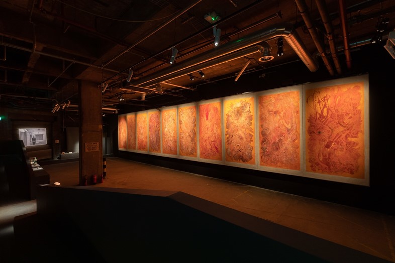
The exhibition also includes the actual “Concrete Masterpiece” by the film’s incarcerated artist, Moses Rosenthaler. These large-scale artworks with the violent undertones of Francis Bacon and the sculptural quality of Larry Poons, were created by real-life artist Sandro Kopp. “There's so much detail in them. Sandro spent months working on a style. The storyline with the paintings is that they’re like something that is going to change the world of painting, so it had to be something energetic and vibrant painted into the wall with texture. It had a to feel like a step-change in painting.”
Anderson’s movies frequently gesture to their own artifice, kicking back against realism and mundanity in all spects. Models and miniatures of improbably grand or impossibly precarious exteriors are an important part of Anderson’s visual repertoire. “When we started assembling the exhibition, I think when it really came together was that towards the end when you start putting the miniatures (made by Simon Weisse) inside,” Timon Hill says. “This is something that you really only get in Wes’ films – because there are these miniatures, and set pieces, and props, and costumes that are also intertwined to the creation of the style.”
There is an incredibly detailed, scaled-down recreation of Howitzer’s house – a brilliantly realised architect’s nightmare of gothic turrets and latticed windows. He explains how these models play a vital role in Anderson’s filmmaking process: “There are a lot of reasons why you shoot as a miniature. One of them is the cost of going to a location that looks like this. The other thing is, nothing looks like this.”
The models allow Anderson to fulfil the scope of his imagination that can’t be adequately met by real-life locations while also becoming part of the leap of faith we take as viewers; he invites us to suspend our disbelief. “Once you're in Wes’ films, you just accept the miniatures as part of the storytelling.”
“These theatre drops are painted by the opera painters on the Parisian opera, and they’re not done to look hyperreal, they’re done to look like scenery because it adds character… It’s not apologetic of being scenery,” Timon Hill tells us, pointing out the handpainted backgrounds on display. “A lot of directors would try and make everything look real or hide the cuts, whereas Wes doesn’t hide them. It’s okay to be scenery – it‘s a film and we‘re telling a story and the story is the most important thing.“
While this theatricality is a defining aspect of Anderson’s visual language, it’s also impregnated into very the structure of his films, which so frequently contain the production of plays as a storytelling device. From Max Fischer’s elaborate school productions in Rushmore to the kabuki theatre in Isle of Dogs, the majority of Wes Anderson films also feature plays enacted within them, like succeeding antechambers of stories within stories.
“A lot of directors would try and make everything look real or hide the cuts, whereas Wes doesn’t hide them. It’s okay to be scenery – it‘s a film and we‘re telling a story and the story is the most important thing” – Kevin Timon Hill
The distinct colour palette, directorial style, and stylish knitwear, the look, feel, and disposition of a Wes Anderson movie emerged almost fully formed in his 1996 debut, Bottle Rocket, and has crystallised into perfection ever since. How does an art director begin to interpret such an accomplished and comprehensive world-building vision?
Timon Hill explains how the process works: “Adam Stockhausen, the production designer, will work with Wes right at the beginning. Wes will have a view on what he wants to create that Adam will be in on very early, feeding in references, styles, graphics and, you know, period-correct references or film references. That communication happens really early in development, so by the time I come on board, there's already a language formed and storyboards that have been designed to a certain degree, drawn with perspective lines and objects that you have to figure out. It could be a couple of lines on a storyboard that just blocks the edge of the frame and then when we draw it in the art department becomes a whole bookshop. So there’s an addition of detail that happens as it comes through the art department that this kind of process.”
Anderson draws on an abundance of cultural references, wearing his heart on his sleeve when it comes to his inspirations. His films are love letters to filmmaking itself, taking beloved new wave European cinema of the 1950s and 60s and cult American films of the 1970s, and reconceptualising chosen elements through his own idiosyncratic lens.
“I mean, Wes literally has reading lists of references – from film references, and visual references… Adam has archive folders filled with selected references that are hero for things like props, windows, details, as well as a whole other folder of references of just look and feel,” Timon Hill continues. “Once you get those briefs, you have to go and fill in all the gaps. So if you’re an art director on a set, you get given a storyboard and you are given the reference folder, the hero reference folder, and then you have to fill in all of the architectural details that are not there and flesh it out to create the real thing.”
The challenge of transforming this constellation of disparate references into something solid that hitherto only existed in Anderson’s imagination is a process of continual refinement and revision. Timon Hill explains, “You may not get it the first, 10th or 20th time, because you have to continue to fill in gaps until you found what Wes was looking for. Sometimes, Wes will have an exact thing in mind because he’s seen a reference, but the reference never made it to you because it was in passing. And sometimes you have to go through lots of variations to get to the point that you find what he saw when he was thinking of the storyboard.”
Another defining quirk of Wes Anderson’s filmmaking is the way his movies seem to occupy a more innocent, romantic pre-Tinder time whilst resisting being anchored in a specific decade. His characters live in a world of writing longhand; of notes delivered on hotel stationery; of reading paperbacks rather than e-readers; of Greyhound busses, smoking carriages, mix-tapes, and landlines. How does Timon Hill echo this in his approach to art direction? And how would he define it? “There's no timestamp. There’s a field of reference and there’s the 1950s and 60s vibe, but the language will cross multiple periods,” he tells Dazed. “The timestamp is sort of more about the character than it is about being accurate to 1963. You know, you may find a phone that was in 1960 in a scene that was supposed to be 1955 but it doesn’t matter if it was the right looking phone. I think a lot of that kind of flexibility is what creates that feeling of timelessness.”
Rumours abound about the next Wes Anderson film as Margot Robbie, Tom Hanks, and Scarlett Johansson join the cast, Tilda Swinton enigmatically reveals that, despite being shot in Spain, it’s “not about Spain”, and Bill Murray lets it slip that the upcoming film’s title is Asteroid City. As we drink a cafe au lait in Le Sans Blague, I take the opportunity to ask Kevin Timon Hill if he can shed any light on the legendary director’s mysterious next project, but his lips are sealed. “Unlike Bill Murray, I can’t say anything,” he demurs. “He’ll get in a lot less trouble than I will!”
The French Dispatch opens at cinemas across the country today and the exhibition is at 180 The Strand until November 14, 2021
